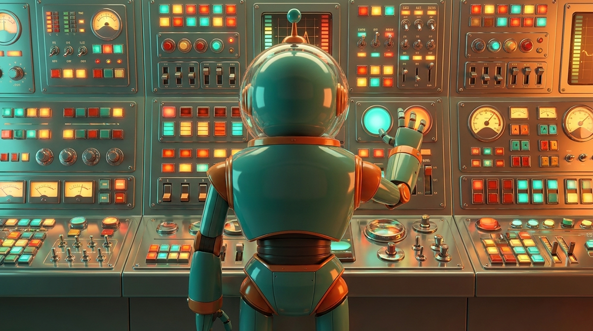
Why Does Your Website Feel Exhausting to Use?
Because every extra choice, field, or option is asking for effort most visitors won't give.
Human-centered design gets talked about like it's a philosophy, something about empathy, about "putting people first." It is that, but in practice, it's simpler and more measurable than that. It's about how much mental work you're asking someone to do, and whether they'll actually do it.
Every choice you put in front of a visitor costs something. Not money, attention. Each option is a small decision: read this, ignore that, click here or there. People have a limited budget for that kind of effort, especially on a site they've never seen before, from a business they don't know yet. Ask for too much of it, and they won't spend it. They'll leave.
I had a client who insisted their homepage hero needed every option a visitor could choose: every service, every path, every button, all in the first section. No amount of pushback moved them off it. And this isn't a one-off. It's the most common pattern I run into: businesses trying to cram every possible next step above the fold, because leaving something out feels like leaving money on the table.
The instinct makes sense. If a visitor might want any of five things, why not show all five right away? But that's not how people actually decide. Faced with five choices and no clear reason to pick one, most people don't carefully weigh their options. They disengage. The fear is missing an opportunity. The reality is losing the customer, because "everything" reads as "nothing in particular is for me."
This is where human-centered design and aesthetics get confused. A hero section can look clean, be well-designed visually, and still overload someone, because the problem isn't how it looks; it's the number of decisions packed into it. Five buttons in a well-designed row are still five decisions. The visual polish doesn't reduce the mental cost of choosing.
The fix isn't fewer options because "less is more" as a style preference. It's fewer options because a first-time visitor doesn't have the context to evaluate five paths at once. They have one job when they land: figure out if they're in the right place. A hero section's job is to answer that, then hand them exactly one next step, not the whole menu of everything you offer.
That's the actual discipline in human-centered design. It's not about restraint for its own sake, or a minimalist look. It's about matching what you ask of someone to what they're actually willing to give. A visitor half-distracted, on their phone, 10 seconds into deciding if you're relevant: that's who the hero section is built for, not the internal stakeholder who wants every service represented.
When you design around that person instead of around your own fear of leaving something out, the page gets easier to build and easier to use at the same time. One message. One path. Everything else can live one click deeper, for the people who are ready to look for it.

Sean Walker, Founder | The Architect
Sean Walker is a Creative Director and Brand Strategist who helps small to mid-sized businesses clarify their message, align their digital presence, and turn attention into qualified growth.
If Your Customers Don’t Start on Your Website, What Is It Actually For?
Most small business websites were built for an internet that doesn’t exist anymore. By the time a customer finally lands on your site, they’re not asking “Who are you?” but “Should I choose you?” Your website’s job has shifted from being a brochure to being the decision room that gives them the clarity and confidence to say yes.
It is easy to assume you have a traffic problem. You might start looking at expensive ads or search hacks to get more eyes on the page. For most small businesses, that isn't the real issue. The problem is that we still treat a website like a digital front door for strangers. That isn’t how it works anymore.
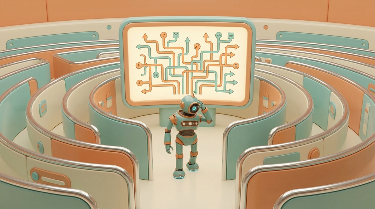
Why Do Visitors Leave Your Website in the First Ten Seconds?
Because the site was never built on a clear answer to who it's for and what it does.
Most confusing websites aren't a design problem — they're a structure problem. This piece breaks down why unclear messaging turns into unclear navigation, and why the fix starts with a message blueprint, not a redesign.
Your Brand Has a Lot to Say. Does it Have a Place to Say It?
People visit, but don’t act. You explain what you do, but it doesn’t land.
You know something is off, but you can’t pinpoint it.
That’s what we fix.
You’ll get a direct breakdown of where your message is unclear, where your site slows people down, and what to fix first.