
Is your website designed to convert?
The simple answer is, "Probably not." Too many businesses use their website as a brochure, telling the world how wonderful they are and what incredible services they provide.
We've all seen this play out before. You spend a ton of money on a new website, sign off on beautiful designs, and launch feeling optimistic. But six months down the road, nothing’s really changed. The contact form is dead, sales calls still start from square one, and the team is hand-holding every prospect through a process the site was supposed to automate.
The website looks great, even impressive. So why does it feel like a static brochure instead of a working part of the business?
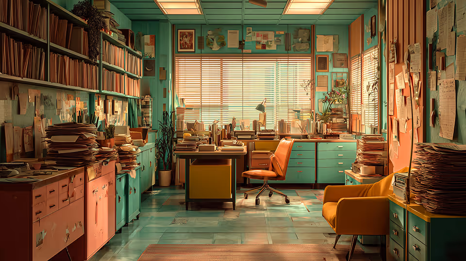
The friction point is almost always a misunderstanding of the word 'design.' In a business context, we’re taught that design means aesthetics—the colors, the fonts, the photography. That stuff is part of it, but it’s the final layer, not the foundation. Real design is about structure. It's the architecture of a system, not the paint on the walls.
Think about building a house. You don't start by picking out furniture. You start with the blueprint. You obsess over the floor plan—how people will move from the kitchen to the living room, how the space flows, and if the layout actually works for the family. The goal is a space that feels intuitive and guides people without them having to think about it.
A website that works is built the same way. Its design is the blueprint that maps out a visitor’s path. It has to anticipate their questions and give them clear answers in the right order. It builds a case, establishes trust, and guides them toward a specific outcome. That structural thinking is what lets a website do real work.
The visuals—the brand identity, the photo style, the typography—are absolutely important. But their job is to bring that structure to life. Aesthetics create the emotional connection and communicate the brand's personality. They're the paint and lighting that make a well-planned house feel like a home. But when you apply beautiful aesthetics to a weak structure, you just get a pretty house that nobody can figure out how to live in.
When a site isn't generating leads for you, it's almost never an aesthetic problem. It's a systems problem. The 'floor plan' is confusing. Visitors arrive, get a quick visual impression, but can't find a clear path forward. So they leave.
Building a website that actually grows your business means changing your starting point. The first question isn't, 'How do we want this to look?' It's, 'What does this system need to accomplish?' You have to define the path before you can pave it. Once you have that clear architecture for your message and the customer's path, you can build on it.
Only then do you add that powerful visual layer. That way, it doesn't just attract attention—it reinforces the entire system's purpose. And when the structure and the aesthetics are working together, your website stops being a passive brochure and starts being an engine for your business.

Sean Walker, Founder | The Architect
Sean Walker is a Creative Director and Brand Strategist who helps small to mid-sized businesses clarify their message, align their digital presence, and turn attention into qualified growth.
Fragmentation Fatigue
Why “Doing Everything” is keeping you from going anywhere.
You’re doing everything right. You’re on LinkedIn. You’re sending the emails. You’re tweaking the SEO. You are working harder than ever, yet the needle isn't moving. It feels like you’re throwing spaghetti at a digital wall, and nothing—not even the expensive stuff—is sticking.

Why Is My Business Hard to Find Online?
You aren't hard to find because of bad luck. You're hard to find because your brand and website were built separately — and a system that doesn't talk to itself can't communicate to anyone else.
Most businesses that struggle with online visibility don't have a tactical problem — they have a clarity problem. Search engines are essentially answering machines looking for coherent, well-structured information, so when a brand's message is muddled and its site lacks logical organization, poor rankings are the predictable result. The fix isn't chasing keywords or algorithm tricks; it's building an aligned system where a clear brand message and a well-structured website make relevance self-evident.
Your Brand Has a Lot to Say. Does it Have a Place to Say It?
People visit, but don’t act. You explain what you do, but it doesn’t land.
You know something is off, but you can’t pinpoint it.
That’s what we fix.
You’ll get a direct breakdown of where your message is unclear, where your site slows people down, and what to fix first.