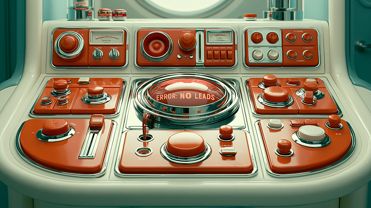
Your New Website Looks Great. So Why Did Everything Stop Working?
A redesign that ignores how your site actually functions doesn't upgrade your business — it breaks it.
There’s a certain kind of quiet after a new website goes live. It’s the silence where you expect to hear from new customers, but you get nothing. The site looks great—cleaner, modern, the team is proud of it. But the dashboard shows form submissions have flatlined and sales inquiries have stopped.
This isn't bad luck. It’s what happens when a redesign gets mistaken for a real upgrade. Businesses spend a lot on a new look, thinking better aesthetics will automatically lead to better performance. When it doesn't, they're understandably confused. The problem isn't the design itself, but the assumption that design alone drives growth.
A website's success is built on its architecture, not its decoration. That old site, as dated as it looked, probably had a structure that worked. It might have had a clear, if clunky, call-to-action that people understood. Its page URLs and content were likely aligned with what search engines were rewarding. The navigation might not have been elegant, but it gave your ideal customer a direct path. The Mission Architecture of Architronic Labs is designed to address this problem.
A redesign that’s all about a visual refresh often dismantles that functional skeleton without even realizing it. In the name of 'simplification,' critical navigation links get buried. To look more 'premium,' direct language is replaced with vague messaging that doesn't connect. High-performing pages are removed, cutting off the traffic that was keeping the business running.
This is the friction you get when you treat a website like a collection of pages instead of a coherent system. A website is a tool designed to do a job: to communicate your value so clearly that it guides someone from curious to converted. Every single piece—the sitemap, the headlines, the button text—is part of that system. When you change the parts without understanding how the machine works, you can’t be surprised when it breaks.
The right way to do this is to see your website not as a brochure to be redesigned, but as a system to be re-engineered. You start with a structural diagnostic, not a mood board. The first step is to figure out what’s already working, find the real friction points, and translate the core logic of your business into a clearer user path.
A successful redesign doesn't just slap on a new coat of paint. It reinforces the foundation and clarifies the pathways. It ensures the structure itself is built for one purpose: to turn attention into real growth. When your site is built on that kind of clarity, the design becomes an accelerator, not a replacement for a solid system.

Sean Walker, Founder | The Architect
Sean Walker is a Creative Director and Brand Strategist who helps small to mid-sized businesses clarify their message, align their digital presence, and turn attention into qualified growth.
A Template Won't Fix It. Neither Will AI. Here's What Will.
The tools keep getting faster. The missing piece stays the same — the system underneath the site.
Whether you used a template, hired a designer, or handed it to AI, a site that doesn't convert has the same root problem: the structure was never built. A website isn't a collection of pages — it's a guided path from question to decision. The tools that build it don't matter much. The thinking that shapes it matters entirely.

Why Is My Business Hard to Find Online?
You aren't hard to find because of bad luck. You're hard to find because your brand and website were built separately — and a system that doesn't talk to itself can't communicate to anyone else.
Most businesses that struggle with online visibility don't have a tactical problem — they have a clarity problem. Search engines are essentially answering machines looking for coherent, well-structured information, so when a brand's message is muddled and its site lacks logical organization, poor rankings are the predictable result. The fix isn't chasing keywords or algorithm tricks; it's building an aligned system where a clear brand message and a well-structured website make relevance self-evident.
Your Brand Has a Lot to Say. Does it Have a Place to Say It?
People visit, but don’t act. You explain what you do, but it doesn’t land.
You know something is off, but you can’t pinpoint it.
That’s what we fix.
You’ll get a direct breakdown of where your message is unclear, where your site slows people down, and what to fix first.