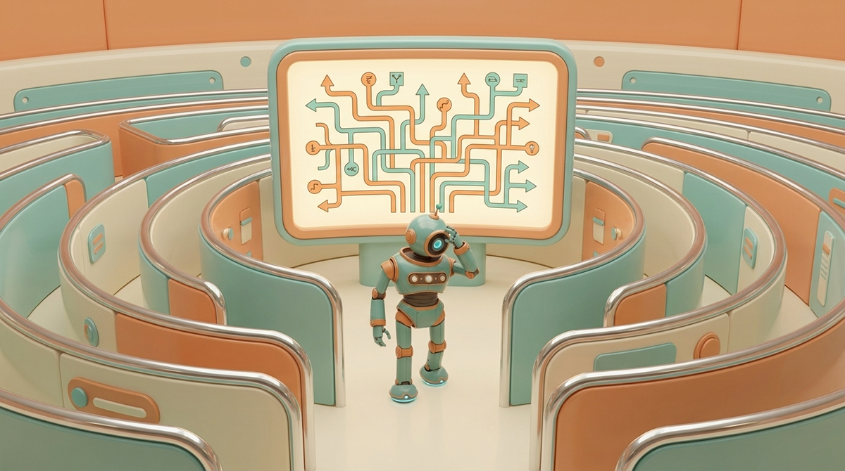
Why Do Visitors Leave Your Website in the First Ten Seconds?
Because the site was never built on a clear answer to who it's for and what it does.
You've got about ten seconds to make sense. That's the window when someone new lands on your website. They arrive with a problem, a little curiosity, and not much patience. For a moment, you have their full attention.
Then it's gone.
They can't tell what you do, who you do it for, or why it matters to them. So they leave.
I've had clients tell me, "our customers know what we do." It's usually said as a reason not to touch the messaging. But it misses the point: your website mostly isn't for your customers. Your customers already know you — they've bought from you, talked to you, seen your work. The site is for the people who haven't. The prospect three clicks into research. The referral doing due diligence. The cold visitor deciding whether to keep reading. Those people have none of the context your customers take for granted, and that's exactly who your homepage has to be built for.
I'm working on a site right now that makes this obvious. It's outdated, and the decision-maker hasn't been through a process like this before, so she's relying on me — and on what she sees other sites in her industry doing. That's a normal instinct. But it creates a specific problem: she's tempted to compete with a site she likes, rather than build a site that accomplishes one goal. Those aren't the same project. One is chasing what looks impressive to a peer. The other is moving a stranger from confused to convinced.
This is also where design and messaging get confused — by AI tools, and by most people. Design isn't the aesthetic. Design is the structure: how pages connect, what order things reveal themselves in, what a visitor is meant to do next. Messaging is the words that explain the value once that structure exists. Sometimes a site's problem is the message — vague, or too clever, trying to sound smart instead of being understood. Sometimes it's the structure — no clear path, no hierarchy, no logic to the navigation. And sometimes it really is the aesthetic — dated, cluttered, hard to trust visually. These are three different problems. Treating them as one is how a "redesign" changes the colors and layout while leaving the actual confusion untouched.
Here's the real question, and it's simpler than most people expect: why do you have a website? (Read about high-performing websites here.)
Not what do you want it to say. Not what should it look like next to a competitor's. What is this site's actual job? Take the clarity audit to see how your site stacks up.
I lean toward less is more. But the honest answer isn't about page count. A site can have 5 pages or 50 — that's not the problem, and it's not the fix either. What matters is whether the homepage, in the first ten seconds, answers what someone needs to know before they do anything else: what you do, who it's for, and why it's worth their next click. If the hero does that job, the rest of the site can be as deep as it needs to be. If it doesn't, no number of pages, features, or design polish will make up for it.
That's the real blueprint work — not the logo, not the color palette, but deciding what a visitor needs to understand first, second, and third. Get that order right, and the copy gets sharper because it finally has a job to do. The layout gets simpler because it's just there to support that path. The design — the actual structure — starts working instead of just looking finished.
A website that works doesn't make the visitor do the work. It's built on purpose, so the ten seconds they give you are enough.

Sean Walker, Founder | The Architect
Sean Walker is a Creative Director and Brand Strategist who helps small to mid-sized businesses clarify their message, align their digital presence, and turn attention into qualified growth.

Why Does Your Website Feel Exhausting to Use?
Because every extra choice, field, or option is asking for effort most visitors won't give.
Human-centered design isn't about empathy as a philosophy or a friendlier look. It's about how much mental work you're asking a visitor to do, and whether they'll actually do it. This piece looks at why cramming every option into a hero section backfires, and why fewer choices, not restraint for its own sake, is what actually keeps people from leaving.
Why Aren't the Right People Finding My Website?
The answer is simple. You aren't answering the questions they're searching for. Your website is all about you, and never really addresses the problems your company solves.
Most websites are built to broadcast services — but customers search for answers to problems they haven't fully defined yet. That gap between how a business talks and how a customer searches is where visibility disappears. Mission Architecture closes that gap by restructuring your site as a communication system built around the questions your ideal customer is already asking.
Your Brand Has a Lot to Say. Does it Have a Place to Say It?
People visit, but don’t act. You explain what you do, but it doesn’t land.
You know something is off, but you can’t pinpoint it.
That’s what we fix.
You’ll get a direct breakdown of where your message is unclear, where your site slows people down, and what to fix first.